ROLE: DESIGN SYSTEM ARCHITECT & PLATFORM OWNER
I led the architecture, governance, and enterprise adoption of Trek’s design system, supporting multiple global product teams and customer-facing platforms. The system standardized UI patterns, design tokens, accessibility practices, and frontend workflows to enable faster delivery, higher quality, and consistent brand execution at scale.
Context
Throughout my career at Trek Bicycle, I was responsible for frontend development across the company’s web platforms. While early efforts focused on delivering features for individual products and sites, around 2012 we began investing in shared frontend patterns and reusable UI components.
These efforts matured significantly by 2018, following a major overhaul of Trek’s B2C web presence. As Trek began modernizing its B2B platform, it became clear that—despite serving different audiences—both systems needed to communicate a consistent visual language while allowing teams to move quickly. Shared components and frontend standards became necessary to support faster iteration in both design and development.
For several years, the design system remained intentionally focused on the web ecosystem, serving as a shared platform for customer-facing B2C and B2B applications. In the early 2020s, other organizations within the business began adopting the system outside of the website proper, recognizing its value as a reusable UI foundation beyond its original scope.
The Problem
Prior to 2018, Trek’s B2C and B2B platforms were developed in separate repositories, and similar user interfaces were often built independently by different teams. Reuse existed, but it was largely informal—typically through copy-and-paste of existing code rather than shared, versioned components.
This approach introduced several challenges. Inconsistent user experiences began to emerge across platforms, and delivery speed suffered as teams repeatedly solved the same problems in slightly different ways. Subtle inconsistencies were introduced each time copied code was modified by a new developer—sometimes improving the original implementation, but often degrading it in small, compounding ways.
Accessibility was a growing concern. While there was a general “leave it better than you found it” mindset, accessibility was not treated as a first-class system concern. As a result, gaps were introduced as components evolved independently across teams.
Design iteration also became a bottleneck. While brand alignment itself was generally well managed by designers, exploratory design conversations and incomplete handoffs slowed development. Mockups often arrived without fully defined states, edge cases, or interaction details, leading to additional back-and-forth and rework during implementation.
These challenges made it increasingly clear that Trek needed a shared frontend foundation—one that could accelerate delivery, reduce inconsistency, and embed accessibility and interaction best practices directly into the components teams relied on.
Constraints & Tradeoffs
Key constraint
A full rewrite was not viable. The system had to be extracted, refactored, and standardized incrementally from live production code while feature delivery continued.
A full rewrite of either the B2C or B2B platform was not a viable option. Both systems had recently been migrated from legacy implementations to a shared SAP Hybris backend, and the organization was focused on iterating on those foundations rather than restarting them.
As a result, the design system effort moved somewhat backwards compared to an ideal greenfield approach. UI patterns and components already existed in production; the challenge was to extract, refactor, and standardize them incrementally without disrupting active development. Nothing could be paused or shut down while this work was happening, and new feature development had to continue in parallel.
While early documentation and guidelines helped, they proved insufficient on their own. Design handoffs were often incomplete, leaving too much room for interpretation during implementation. This made real, reusable components necessary—not as a pursuit of visual perfection, but as a way to encode decisions, semantics, and accessibility directly into the system.
At the same time, attempting to design “perfect” components too early created its own friction. The system needed to evolve alongside real product usage, not ahead of it. Rather than over-engineering upfront, components were refined iteratively as gaps and edge cases surfaced through active development.
Frontend developers were asked to evaluate each new feature and determine whether it should use existing shared components, introduce new components that would be added to the system, or intentionally diverge as a one-off (“snowflake”) when appropriate. When new shared components were required, their creation became part of the normal delivery process, allowing the system to grow organically alongside product work.
Role & Ownership
During this period, my role transitioned from Lead UI Engineer to Software Development Manager – UI. With that change, I became formally responsible not only for the frontend developers working in web technologies, but also served as the final reviewer for frontend standards across the platform.
As the design system matured, I intentionally shifted away from being the primary implementer of components and toward empowering the team to make decisions autonomously. My involvement focused on setting direction, establishing guardrails, and supporting informed decision-making rather than controlling day-to-day implementation.
I remained technically engaged throughout this period, but my contribution was no longer a dependency in team velocity planning. Instead, I stepped in when decisions had the potential to negatively impact areas beyond an individual team’s immediate view, helping balance local autonomy with broader platform health.
I reviewed and approved system changes, influenced component standards, established contribution rules, and helped mediate cross-team conversations when interpretations or priorities diverged. Over time, I transitioned day-to-day component ownership to a dedicated Lead/Architect, ensuring the design system could scale beyond a single individual.
The System
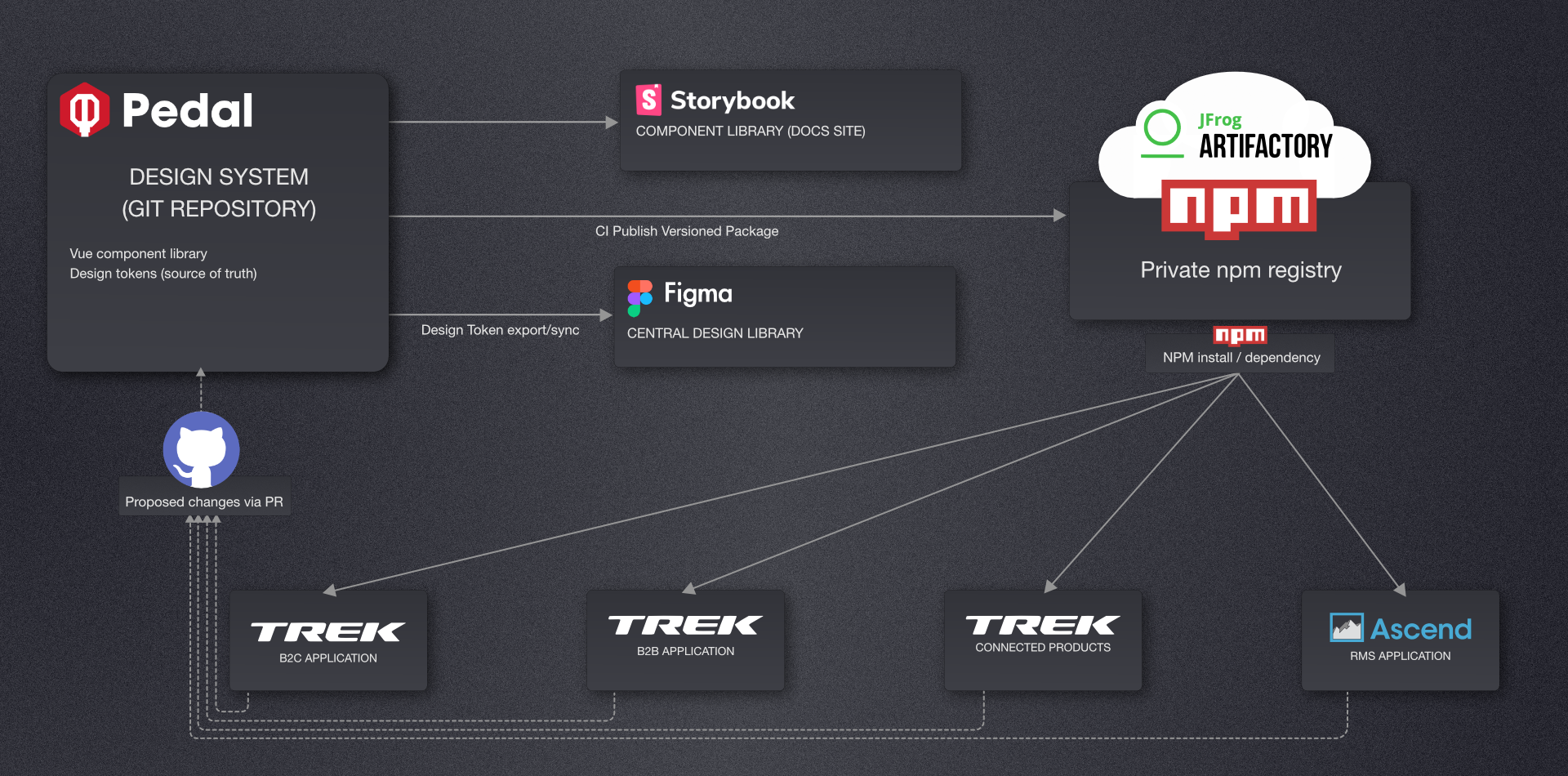
The design system was implemented as a shared component library built in Vue.js, intended to serve both B2C and B2B web applications. The system included design tokens (covering core visual properties such as color, spacing, and typography), interaction patterns, documentation and usage guidelines, and examples published through Storybook.
To support close collaboration between design and engineering, the system was paired with a shared Figma component set that could be incorporated directly into project mockups.
Accessibility as a First-Class Concern
Accessibility was treated as a component-level responsibility, rather than something addressed reactively at the page or application layer. Each component was designed to encode appropriate semantics, interaction behavior, and accessibility considerations by default.
In many cases, this required prioritizing semantic correctness over visual convention. For example, when a design called for a mutually exclusive selection, components were implemented using native radio inputs—even when the visual presentation diverged significantly from the standard circular control.
By baking accessibility into components from the outset, the design system reduced the cognitive load on individual teams and helped prevent regressions as UI patterns were reused and evolved. This shifted accessibility from an individual responsibility to a shared system concern, improving consistency across products.
Adoption & Governance
For the core web teams, use of the shared component library was not optional. As the system matured, it was evangelized beyond the web team and strongly encouraged for use by other groups within the organization. Clear contribution rules made it possible for teams outside the original group to contribute components immediately.
Governance was intentionally modeled after an internal open source project. Teams could submit pull requests back to the system maintainers for review and inclusion. When a need arose that was not considered “system-worthy,” teams were permitted to fork components for their own use, with the explicit understanding that doing so placed them outside the system’s upgrade path.
Impact
100%
Web team delivered faster
Less churn
Reviews focused on solving the problem
~5×
Estimated velocity outside web team
For the core web team, delivery speed improved substantially and onboarding new frontend developers became easier. Consistency improved when shared components were used, and code reviews and demos shifted away from debating UI implementation details and toward solving the underlying product problems.
Outside of the web team, the system’s impact was estimated to increase delivery velocity by up to five-fold for teams adopting it during replatforming efforts.
What I’d Do Differently
Looking back, I would have invested in design tokens earlier and made documentation more explicit—not just around how to use components, but when not to use them. Adoption outside of the core web team also took time, and early reliance on Vue 2 limited broader traction until the transition to Vue 3.
One decision I continue to stand by was unifying teams around a single frontend framework, because it enabled personnel to move between applications during periods of constrained resources and reduced fragmentation across the organization.
This system evolved under real production constraints and delivery pressure. The goal wasn’t a perfect component library—it was a shared foundation that helped teams ship faster, reduce inconsistency, and treat accessibility as a core platform concern.